· 5 min read
Annabelle Selldorf at Cooper Union
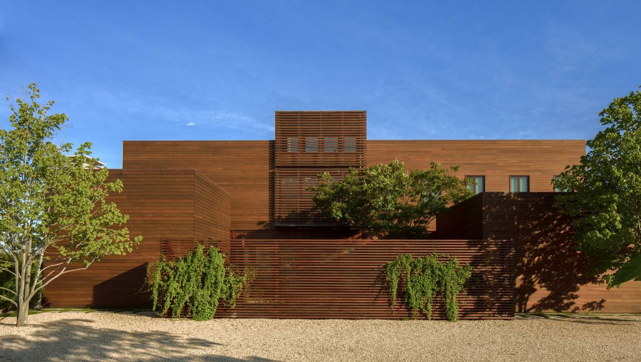
Every time I go to the Cooper Union, it is for a lecture organized by the Architectural League. And every time I get out of it feeling impressed, refreshed, inspired. Once again, this time by Annabelle Selldorf, I was convinced that architecture is very powerful.
Annabelle is from Germany and has lived in NY for 34 years. It all started in 1988 when she founded the company with her partner. Their first project was a kitchen renovation. Then the bathroom was added to the kitchen, and then the whole interior renovation was to design. Art galleries followed and their first ground-up building was in the late 1990s. The large and public renovation of the 1914-dated Neue Gallery building was a pivotal project. The firm counts now 65 people and 4 partners. At the lecture, Annabelle talked about two projects, both located in NY.

Sunset Park material recovery facility, Brooklyn
After visiting the facility and meeting with its operator, it was great to approach this facility through the eyes of its architect!
 This small competition was a public-private partnership. The site offers beautiful views to the city skyline. First thing they did, the architects wanted to understand what a recycling facility is:
- a tipping building where trash is unloaded (accessible for barges)
- a processing building, where the sorting is happening, see here for more details
- a bale building, where the materials are stored before pick-up (accessible to rail and road)
- an administration center. A special asset of the Sunset park facility is its education center (2d floor) that is attached to the administration center (1st floor). Educative animations are designed by Worldwin.

The architects tried out different schemes and worked closely with Sims (the facility operator) to propose an efficient layout. Green space was saved at the tip of the pier and used for water run off retention. It is located next to the administration and education center to connect people (visitors and office workers alike) to nature. Courtyards give comprehension and unity to the different buildings.
 An obvious feature of this building is its structure placed outside of the envelope. The architect not only admires Jean Prouvé structural chef-d’oeuvre but also used the structure to give proportion to the building: rhythm, aesthetics, and scale much needed by these giant buildings.


The architects were very involved in the construction phase of this project. Annabelle insists that this project is a team effort, decisions were shared among different architects of the firm. Its success was achieved by paying attention to everything, getting into every detail without loosing the big picture.
Gallery at West Chelsea, Manhattan
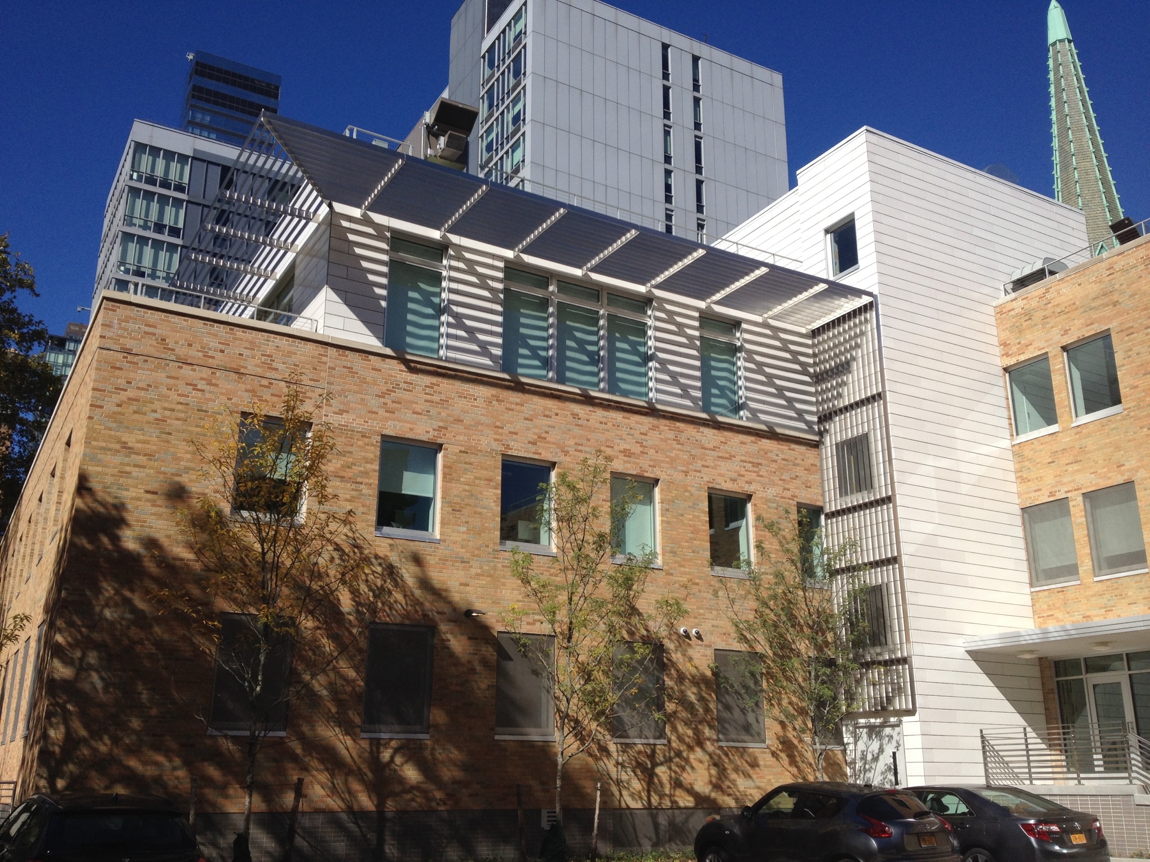
 This gallery located at 20th Street, between 7th avenue and 8th avenue, was a command by long-time client David Zwirner. The demolition of a garage at the back of the plot offered 30,000sf for a day-lit exhibition space. The rest of the building is L-shaped around it.


Annabelle chose to present those two buildings because even if it doesn’t seem so, they have a lot in common. They are both places for people, for the public, trying to make them feel welcomed. By paying attention to every single detail, the design is not too little but not too much.
After quickly pointing out other projects like the condos at Bond Street, the Contemporary art museum in San Diego, the primary school in Zambia, or Luma rail yard building renovation in Arles, the architect has a conversation with Billie Tsien. Talking about the design process, she explains how it always starts with learning. Meanwhile an idea appears and the project then aims at expressing that idea. It is a complex understanding/intuitive process. When asked about her furniture company (VICA), she explains how it appeared with her renovation work. As for projects she is not proud of, she answers that yes, a few ended up not as clear as they intended to be on paper.

