· 3 min read
Tony Fretton at Paris Belleville

Last week, the English architect Tony Fretton gave a speech at the National School of Architecture of Paris Belleville. He presented some of his best work:
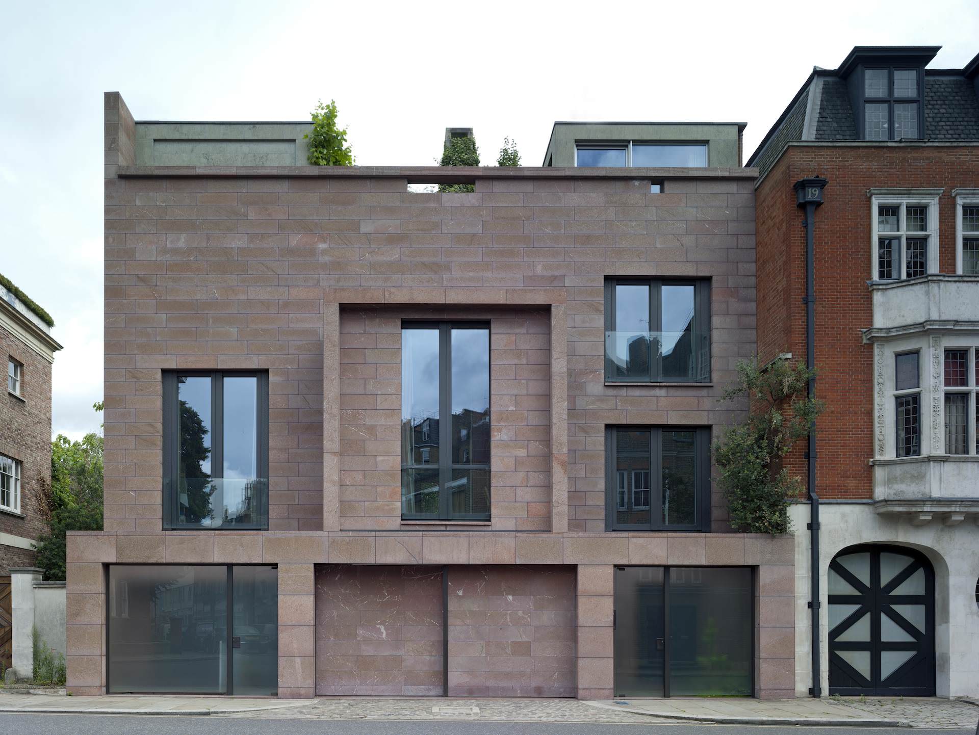
Red house, London  In this project, Tony Fretton copes with urbanism by addressing specific relationships between the building and its surroundings.
Various features, such as corniches or windows dimensions, are recalled from the adjacent buildings.
The roof garden of the house is a dream-space, away from the city.
Modern architects simply established a tabula rasa with the past. Contemporary architects feel uncomfortable towards the past: how to deal with it?
Tony Fretton appreciates history as a collect from the past.


This is the story of a contemporary building in a historical setting. In this particular context, every building is the background of the church, which is remarkable.
The existing building facing the site is of Baroque Rococo style, an interesting style to develop. The new building is an abstract version of it. The architect proposes here a critic about classicism and an observation about modernism.
Because of different adjacent buildings, each façade is different, says something different.

What should an ambassy look like? It was left up to the designers to talk about their country.
At some point, pragmatism stresses evident facts: the site is facing south, the façade design needs to take this into account. A double-skin façade was created, with a strong building inside the glassy transparent one.

The building is optimized for a minimal cooling.
A garden at the back is a place to go out for workers.
From the huge, transparent and clear counsel chamber, you can see the city outside.

The site is a farm yard, near a classic mansion.
As it is lost in the countryside, you need to express a sense of arrival when entering the site.
The architect wanted to show the landscape, which is made by people, a controlled artifact.
The entry door gives a sense of community.

Art is what you are looking at and the building architecture shouldn’t be oppressing. But still, you have on the side of your eyes the architectural surrounding, supposed to help you to concentrate on art pieces.

Everywhere in the museum, you have these views of the land, you know you’re in the countryside.
At the end of the enfilade of sculptures, there is a window to the landscape. At some point in the course, you even end up in a room where there is nothing else to look at.
Tower Wharf Restaurant, London

How to make a new functional restaurant building in front of an old gigantic castle?
This restaurant is offering somewhere to sit and rest on the water edges.

The client wanted a building that would last 200 years. This building looks like the first high-rise buildings of Chicago: sober and urban scaled.
Poetry is carried by pragmatic decisions like the tree hanging facade, or large glass panels.
Westkai residential towers, Belgium

 The two towers are located next to other towers designed by Roger Diener (the two first glassy façade towers) and David Chipperfield (the two white concrete middle towers).
For budget reasons, the primary material ended up to be bricks. Specific horizontal and vertical ornamentations were developed.
“As a young architect, I wanted to control everything. But more and more I see that you can’t; and it’s actually good to let people choose what they like.” The role of the architect is then to facilitate appropriation and comfort.


