· 2 min read

BoD: Riverside Health Center
This week, archtober got me to the Riverside Health Center, designed by 1100 architect.

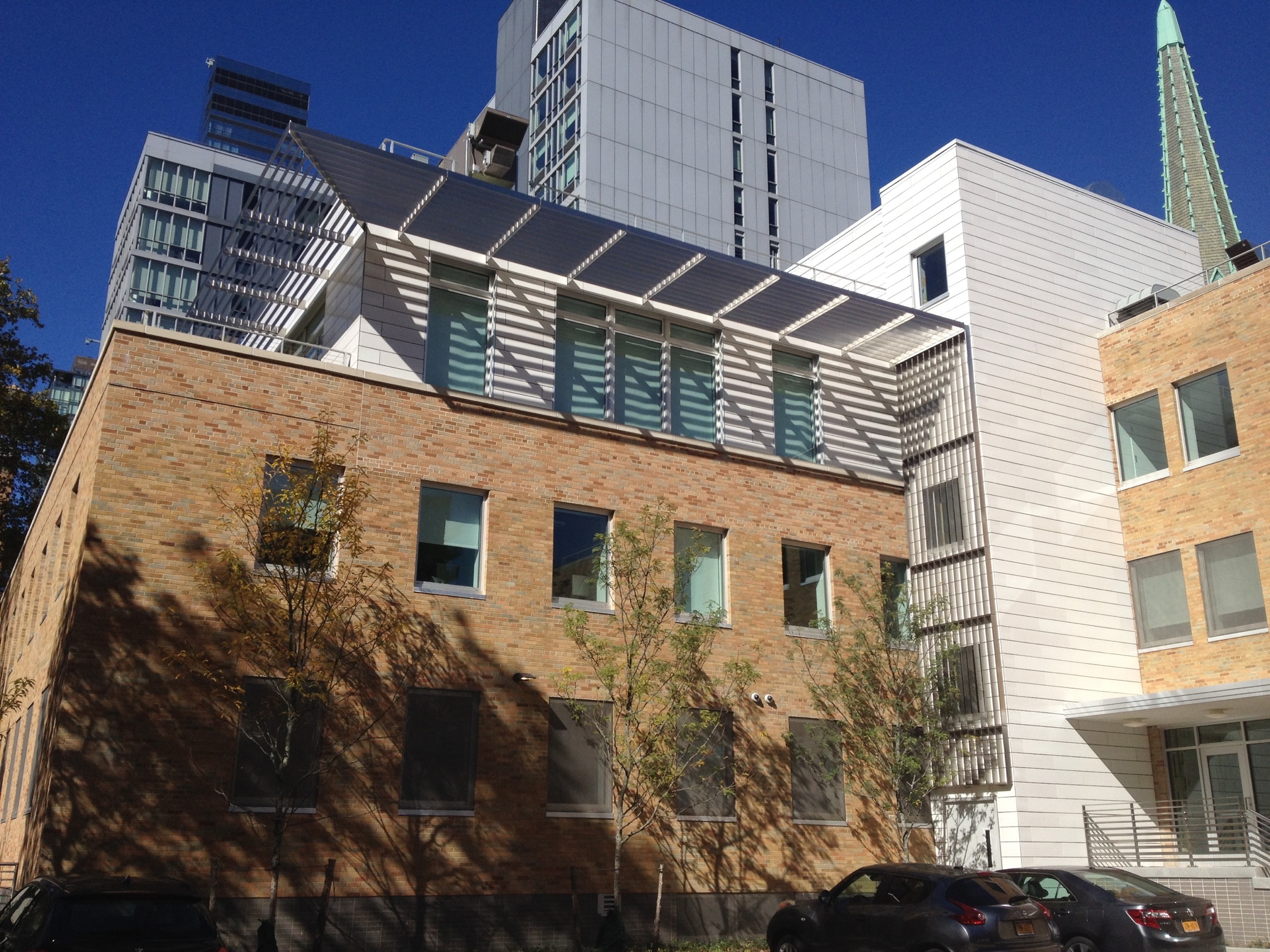
Here is a front view. The huge renovated terra cotta "column", housing the existing staircase, is a strong feature of the building.


The main façade, from top to bottom: new anodised aluminium windows, new "buttoned" white terra cotta cladding, original multi-colored brick (replacements aren't that obvious here), original grey brick (matching colors for brick replacement was more difficult here).


See the elegant transition from vertical to horizontal railing.


From the back courtyard of the building, you can see the new parts covered in white join-less terra cotta: an addition on the top and a new staircase.


One of the LEED efforts was to encourage the use of stairs: more visible, first accessible (compared to elevators), and healthy notified.


The original terra cotta outdoor column is replicated inside.


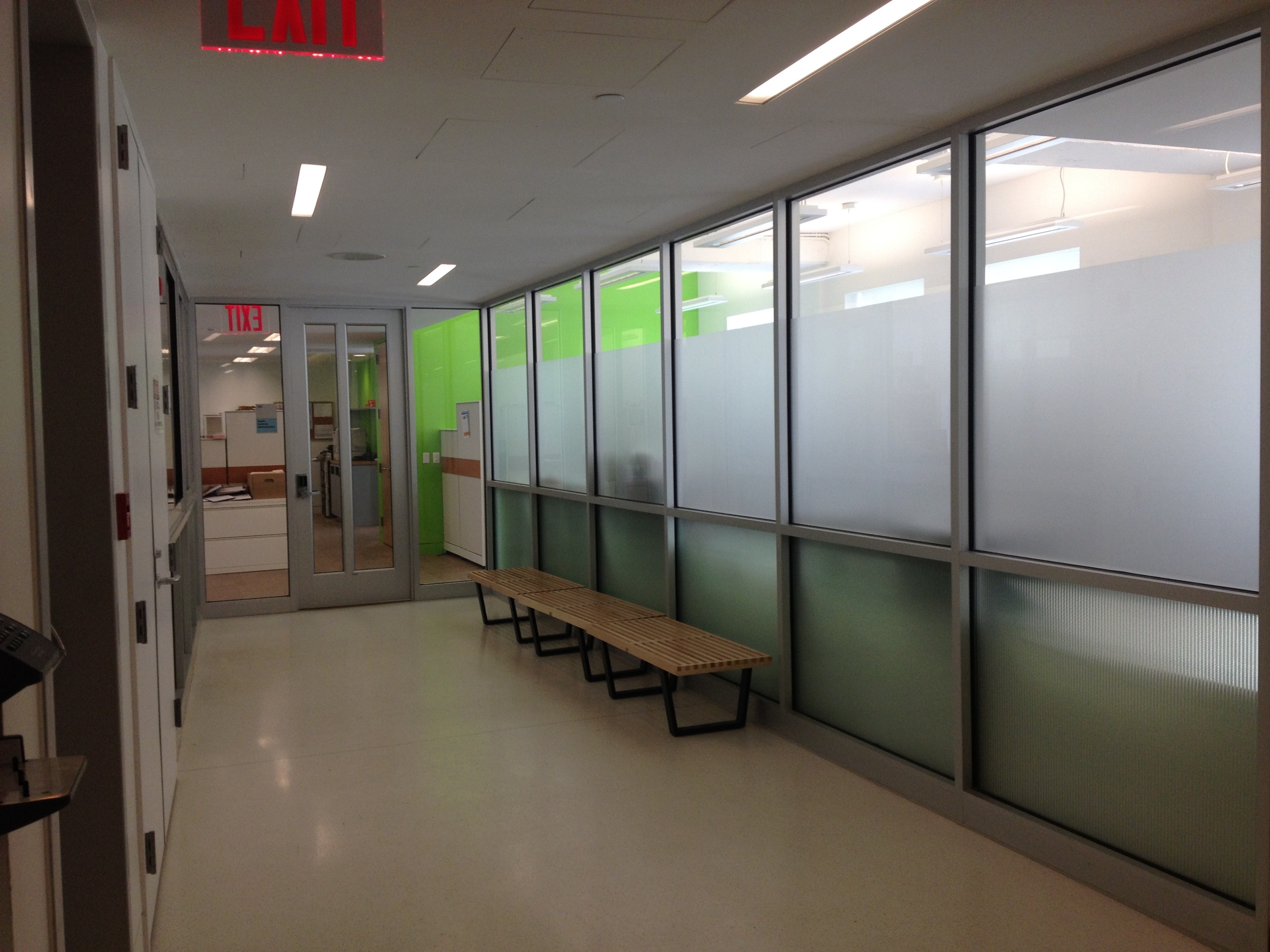
Each level is organized the same way, with elevators facing the stairs and classrooms on each side, so that you don't get lost. The corridor is sideways shaped for a dynamic and welcoming effect.


Visibility, transparency, simplicity are master-words for the different spaces organization.


When you enter a classroom or an office upstairs, when you leave the circulation space basically, here is the wooden floor you encounter. A bit thicker than 2inches, it is made of discarded wood from window manufacture.


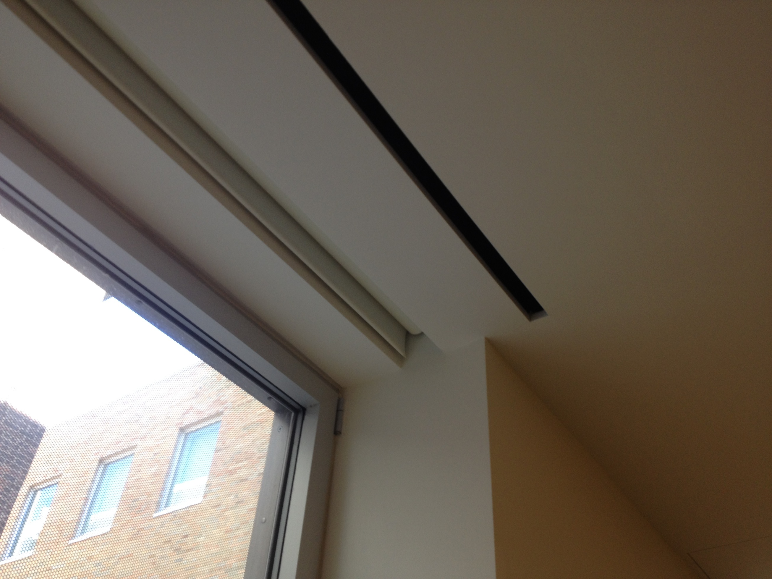
The windows are "european style". You can open it sideways (easy to clean the outdoor side) but also top-ways to use it as natural ventilation without opening it completely (security matter).


Technical elements are neatly integrated within the plaster ceiling.


The green terrasse is not accessible and serves as a nice water garden.


Those vents enable to insuffle air deep into the room. The ceiling and the windows were thus kept as high as possible.


To integrate the central structural beam on one hand, and the side ventilation equipment on the other hand of this large open room, the ceiling is inclined to two converging slopes.


The corners are rounded to easy the circulation.


The bottom part of the circulation walls is covered with a thick, soft, easily replaced layer for long-term use.


On the basement, a conference room is available for classes but also for the local community. On the ceiling, the soundproofing and technical elements are integrated in the warm wooden layer.


Find an other report on this building tour on archtober’s blog.

    Partager via :
    Back to Blog