· 4 min read
BoD: Kickstarter

Once again, I’m dragged to Brooklyn to an other inspiring and beautiful adaptive reuse project. This time, Archtober led me to visit Kickstarter’s headquarters, designed by Ole Sondresen architect.
This post won’t be a full report as the one from Camila Schaulsohn here but a bunch of pictures and a few interesting points explained by the architect.
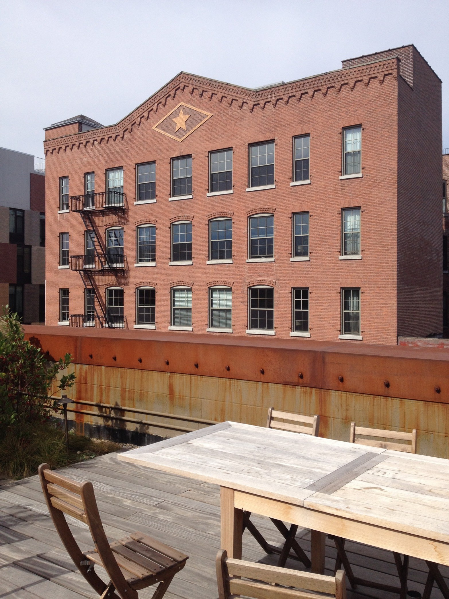
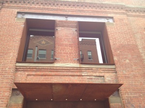
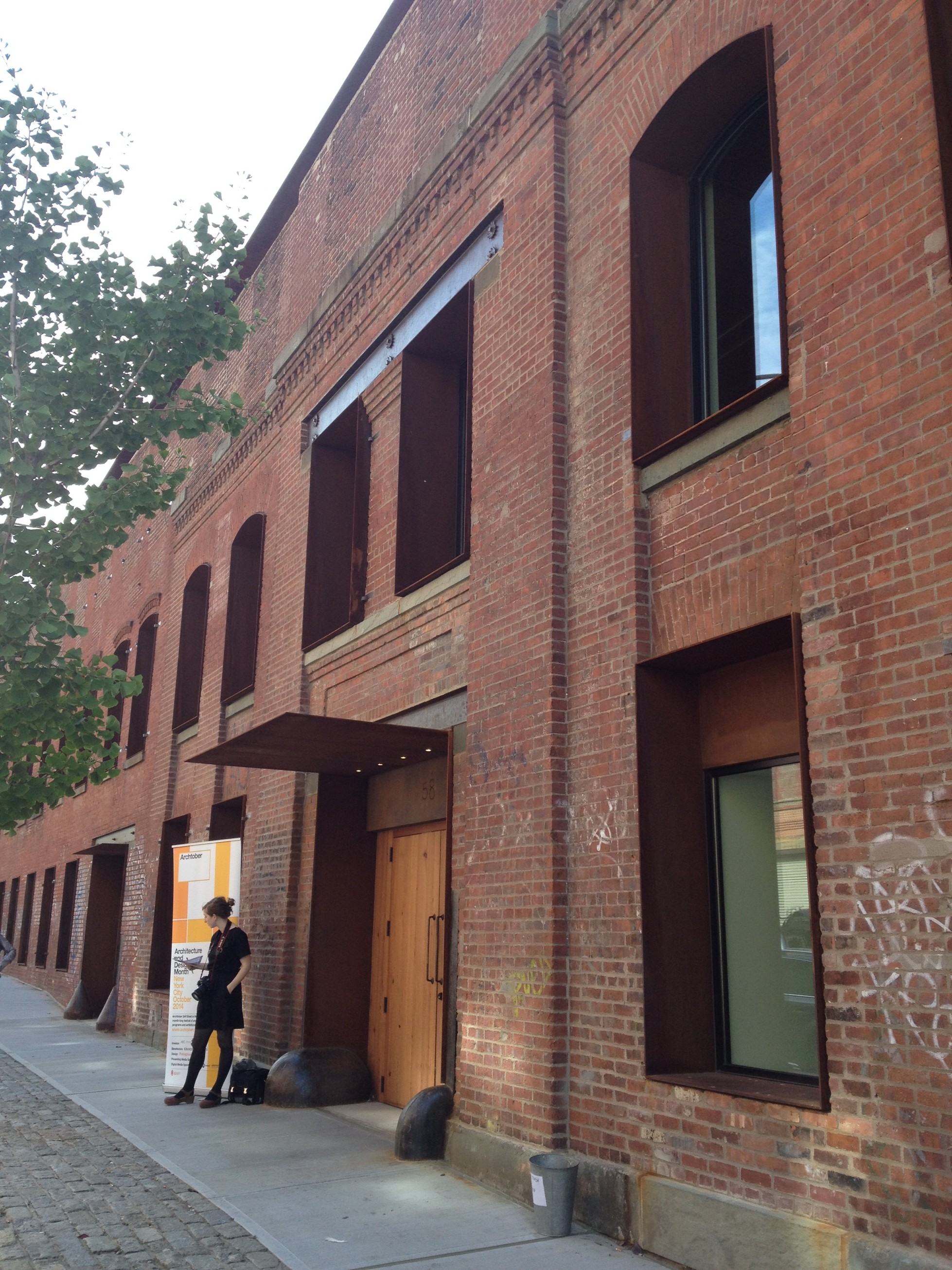
Fed up with moving from one place to the other, Kickstarter was looking for a place which would be cheap, adaptive and large enough to foresee a fast growth. They found this building, supposed to become an hotel. Except from the façade, which is a registered landmark, there was only a concrete slab under the street level, steel columns and a first level slab.
The firm has a young, open-minded and shared community spirit, which is perceptible in the spaces organization. Beside, an art gallery is open to the public and used by the local community.


A central courtyard brings light down to the center of the ground floor. The garden is planted with only local species and works as a rain water reservoir.


The theater, or screening room, is 74seats. It could fit more but 74 is the threshold above which you avoid drastic building rules. The seats itself were collected from a closing theater.
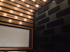
The architect, before a carpenter, is very sensitive to wood materials and tree species in terms of finishes. Each reused and raw materials available has been affected to a location its finish and natural features fitted the best.
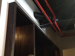
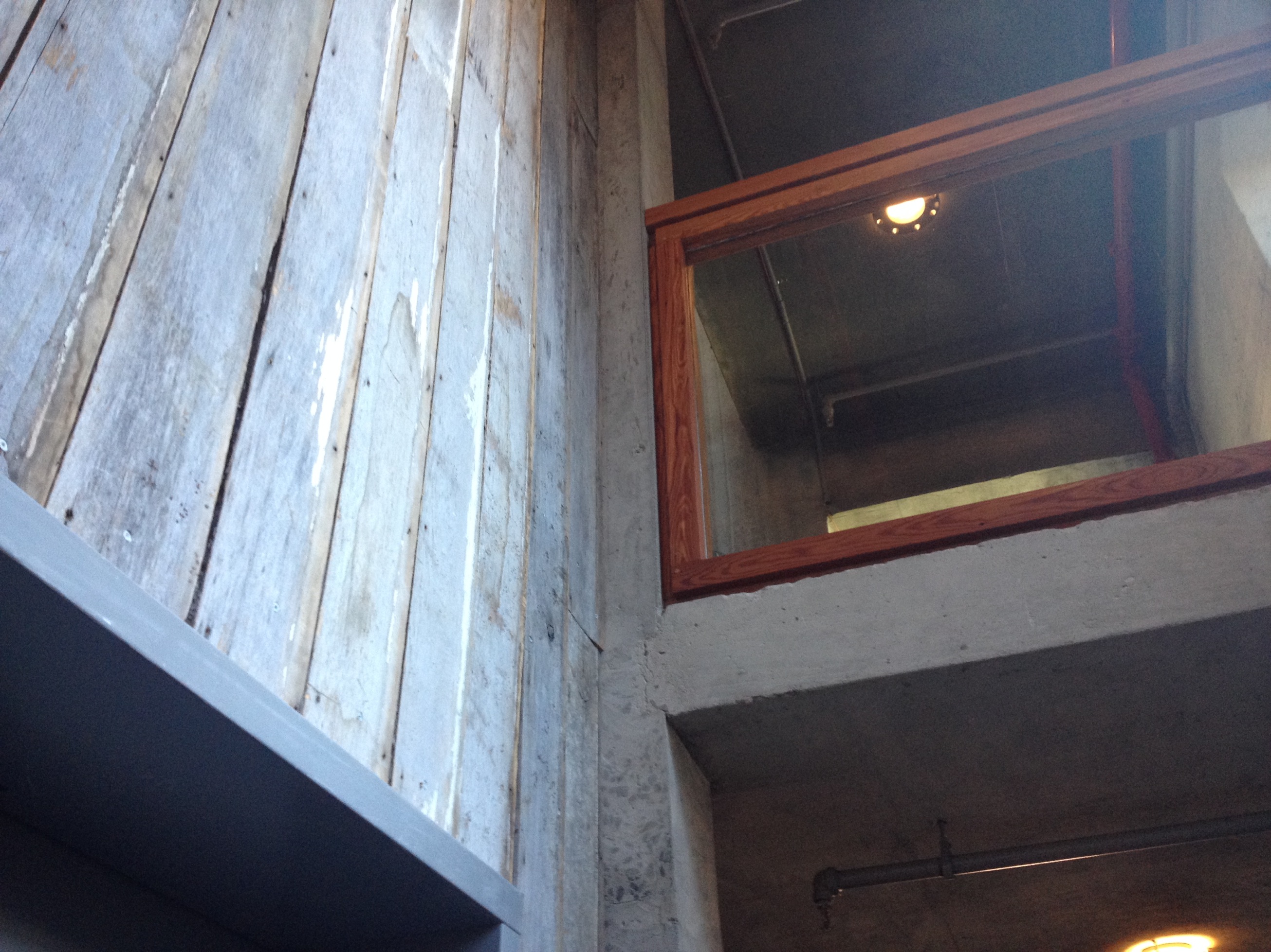
We soon understand the architect’s position as fundamentally sustainable. Even LEED certification sounds ridiculous when it is about adding specific materials, which are unnecessary in that case. Here, it is about doing the best with the less. Being clever and find adaptive solutions is sometimes more efficient than adding high tech inadequate systems. Also, on-site materials and local ressources are systematic considerations.
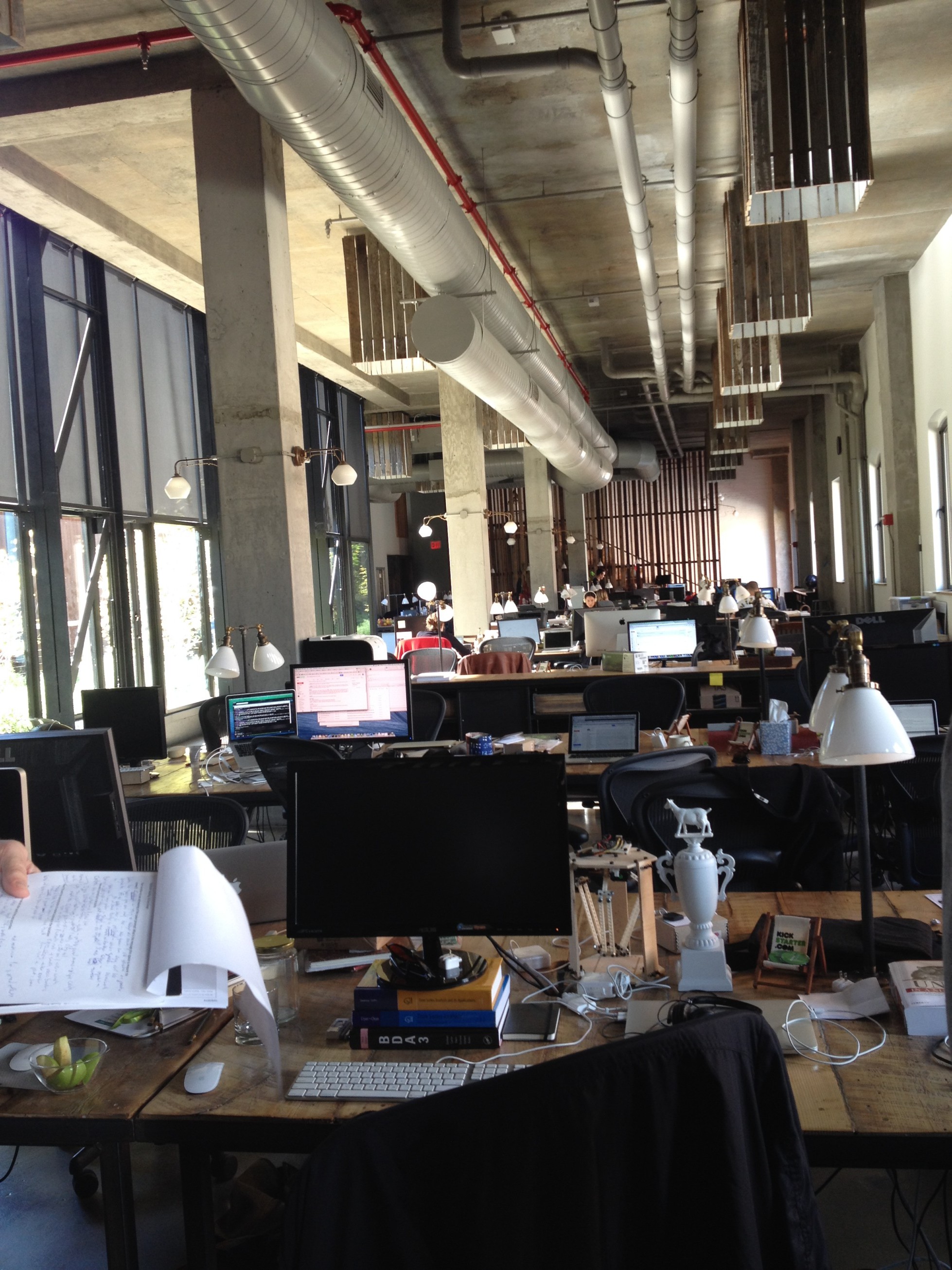
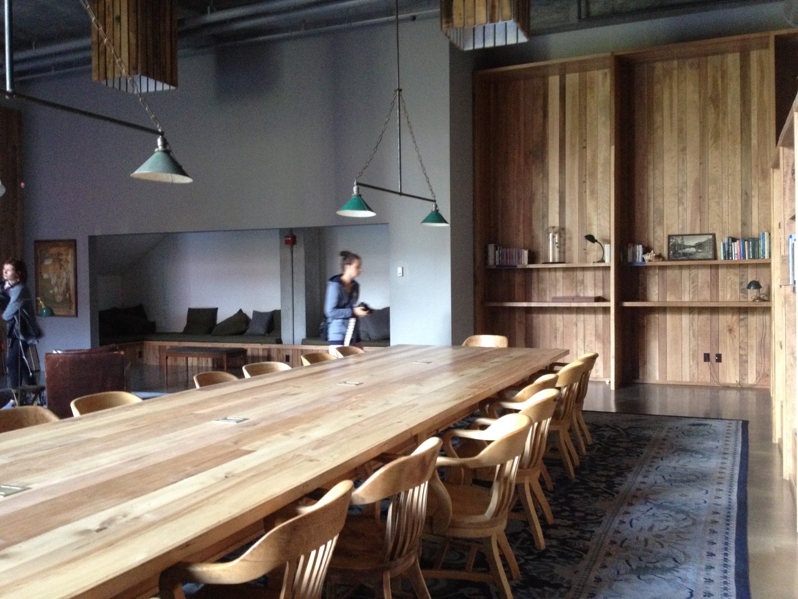
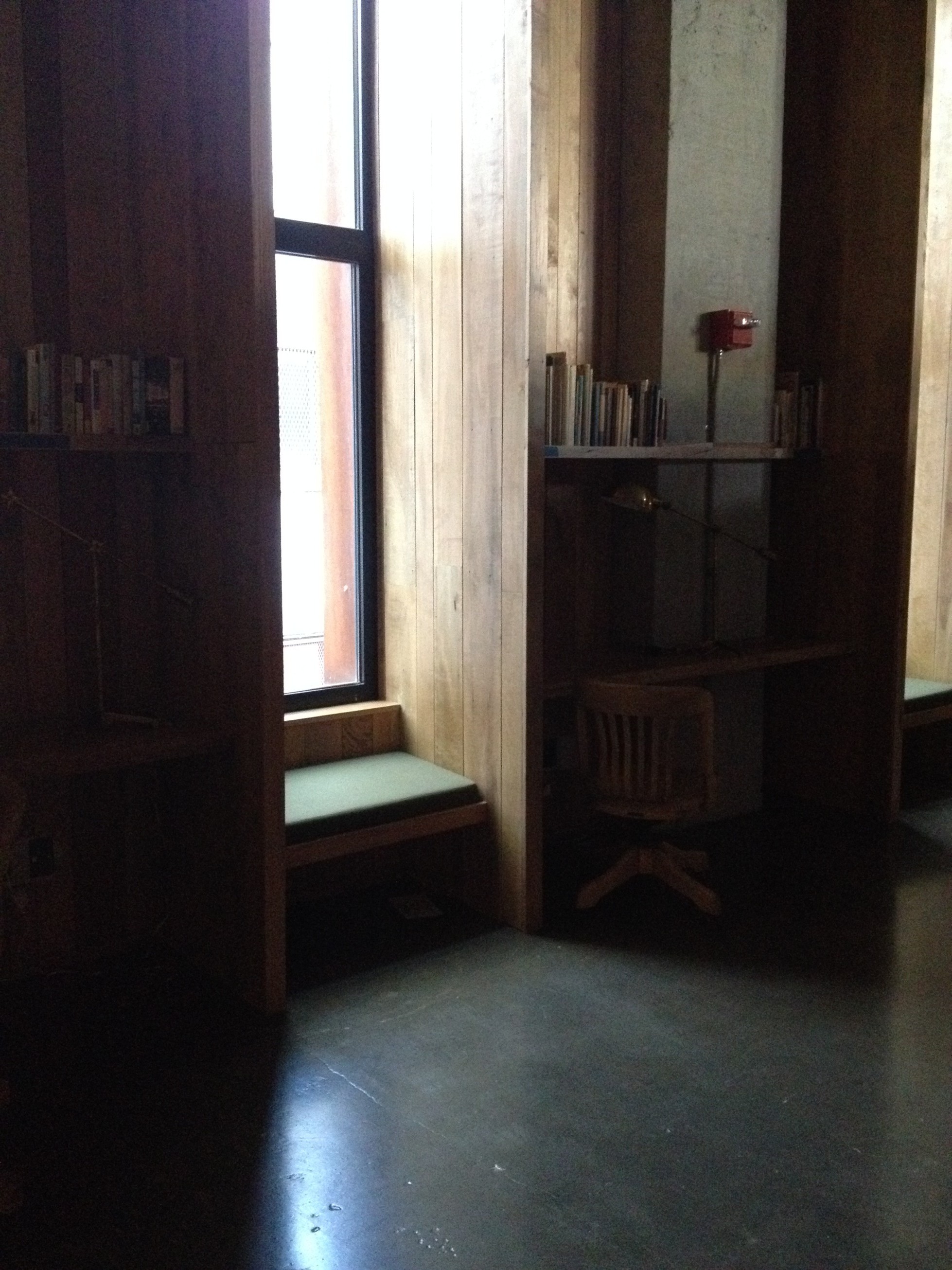
 The library is an other wood paradise. It actually feels great in that room!
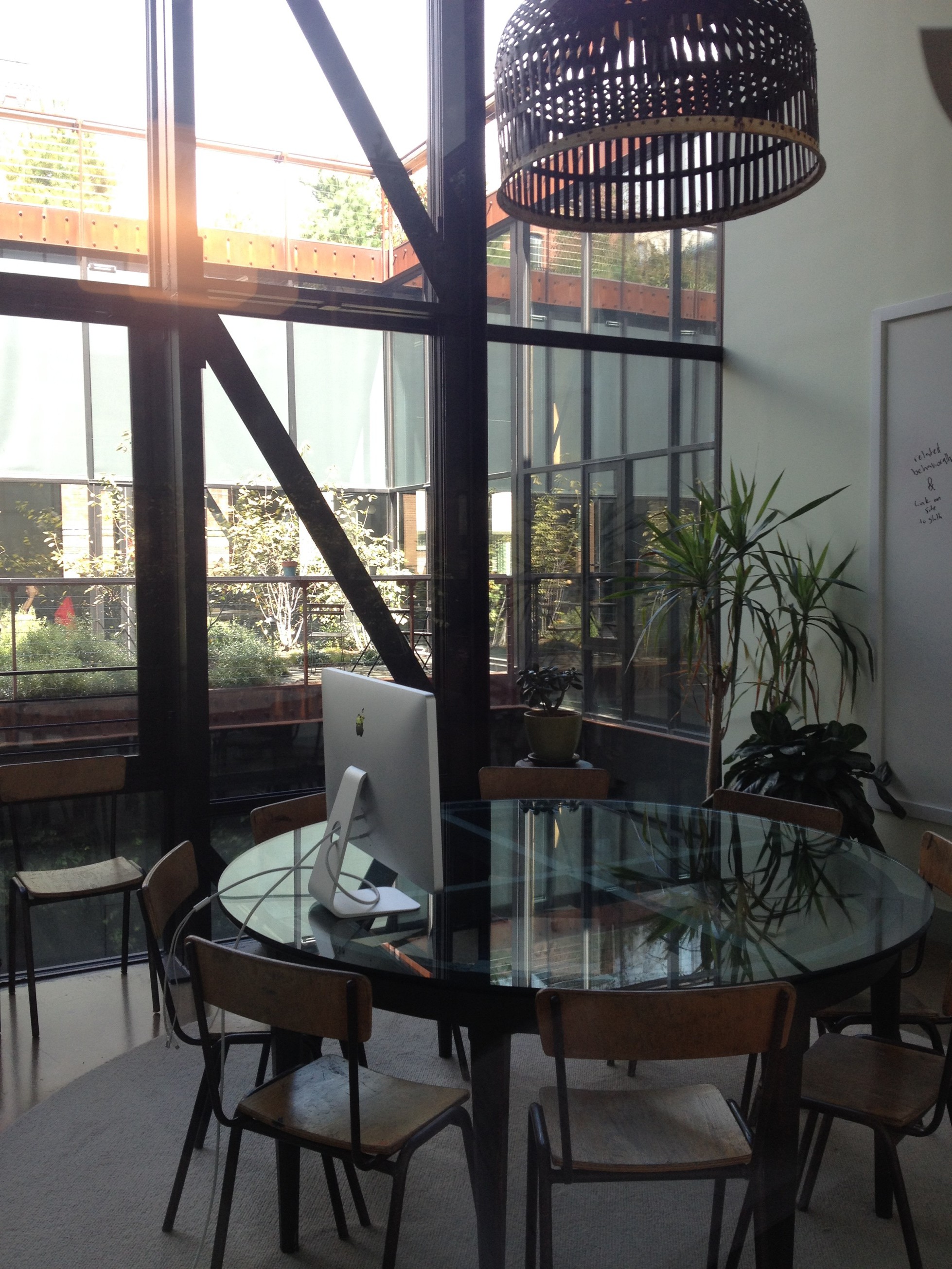
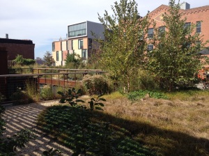
As we keep going up, we soon discover the rooftop, which is a natural haven. Directly opened to the garden, a luminous room is in between outdoor and indoor.

All in all, this design gives a great image to Kickstarter. I hope the spatial features are reflexions of the start-up’s social attitude.
Above all, the architect’s attitude towards sustainability is very interesting. The word is here fully weighed and not limited to checking a list of boxes. Everything has been carefully thought to be as energy efficient, health harmless and use-adaptive as possible.
Thanks Ole Sondresen for this great building!
