· 4 min read
Artistic and data related mapping
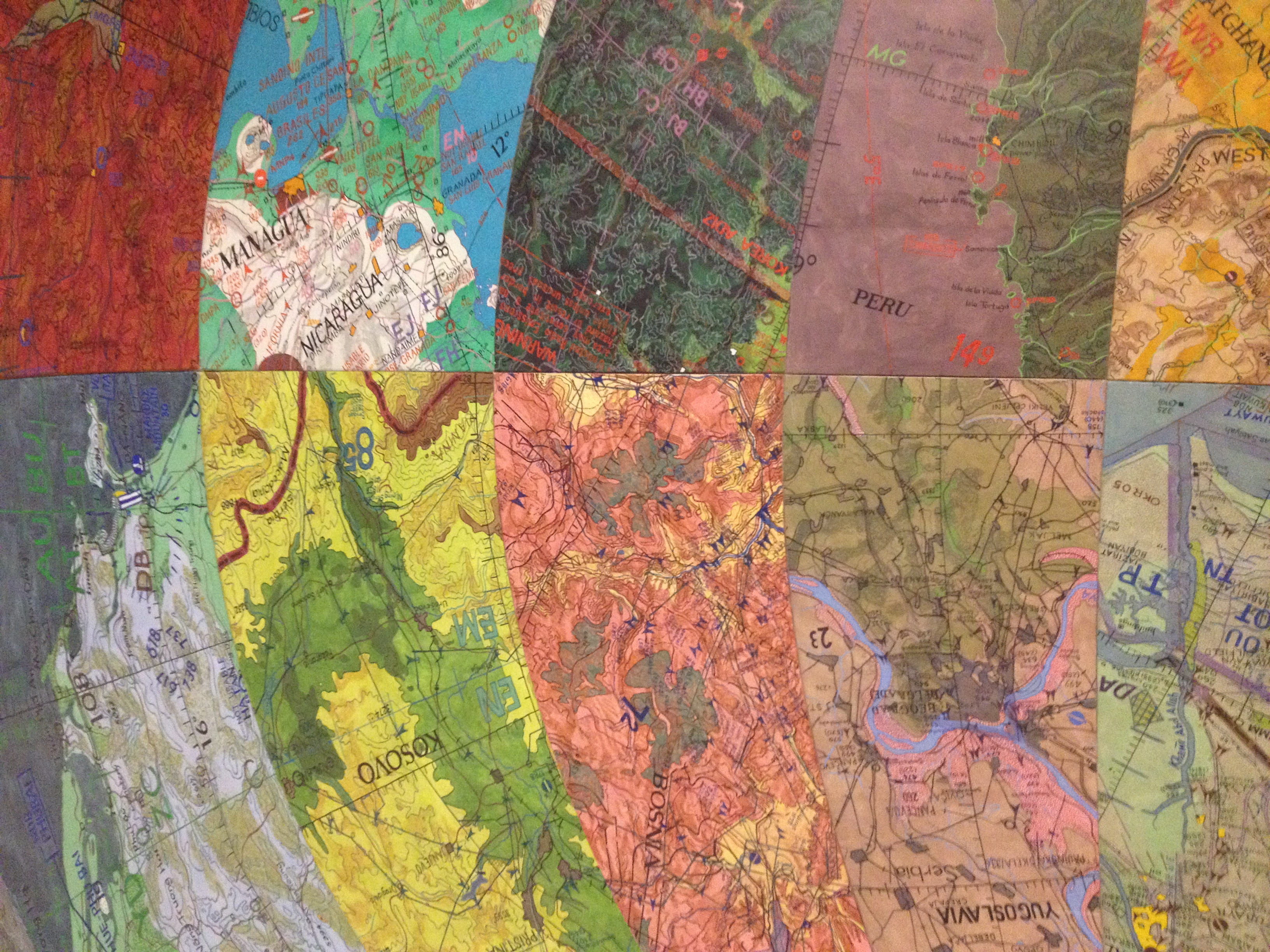
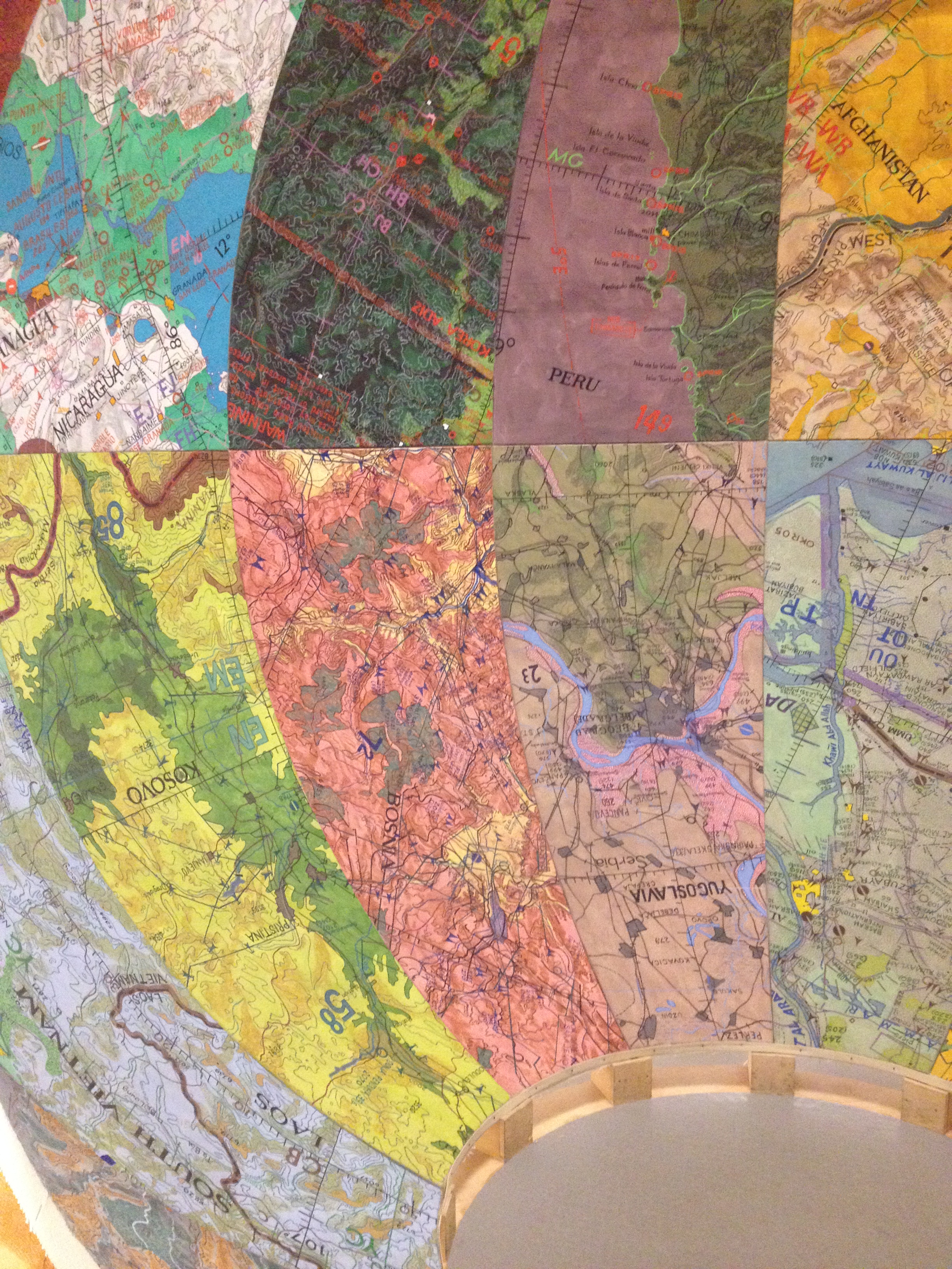
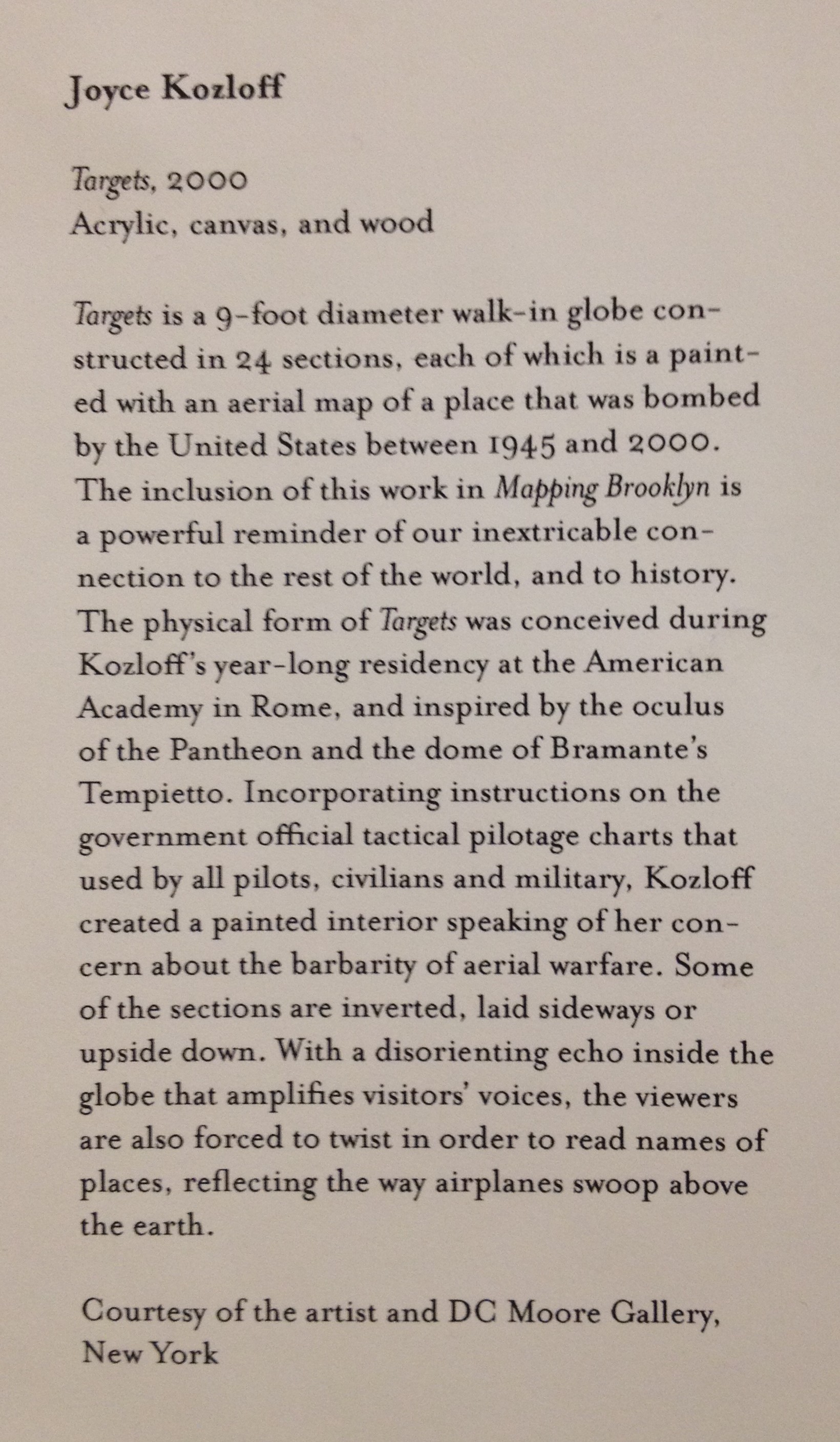
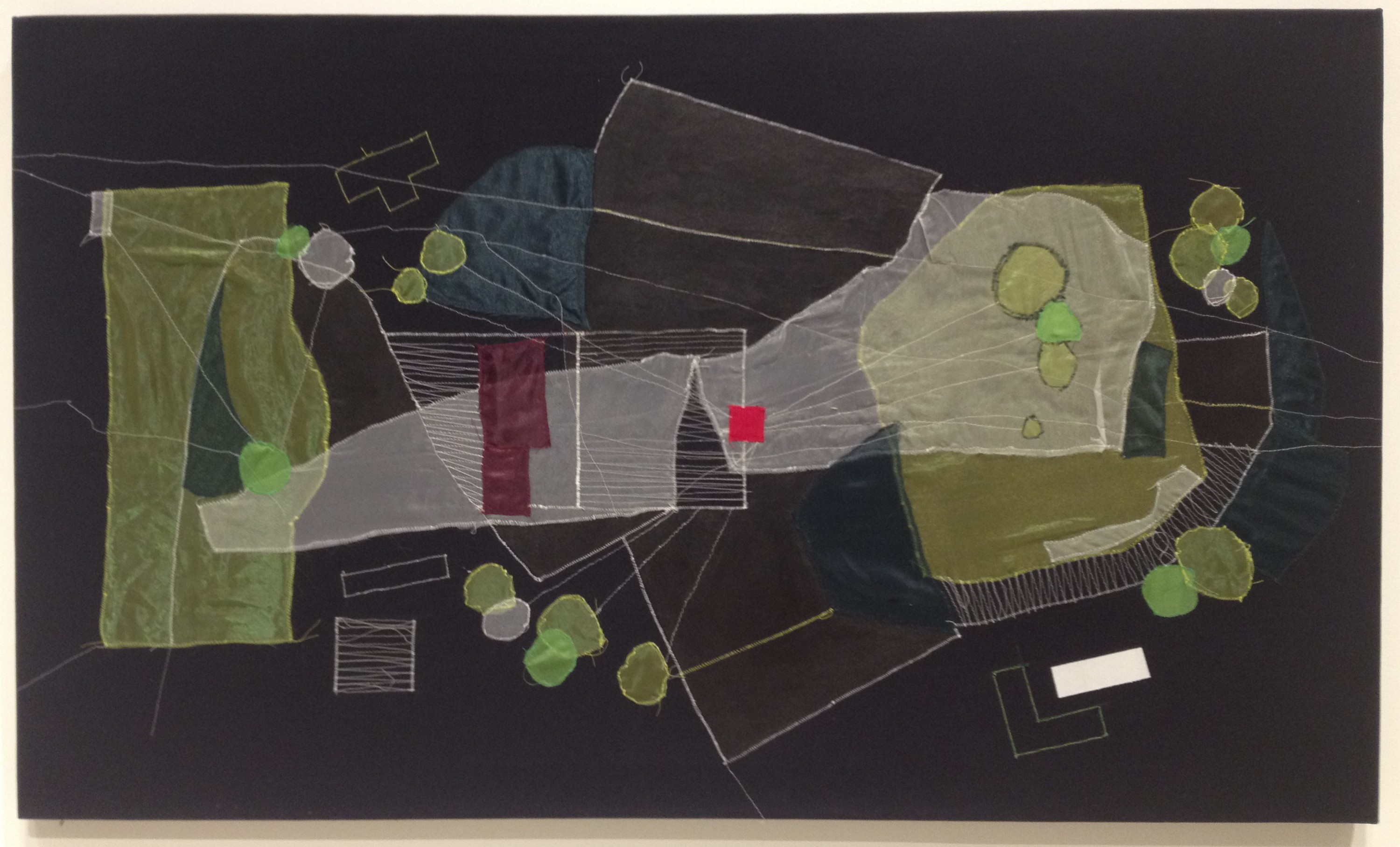
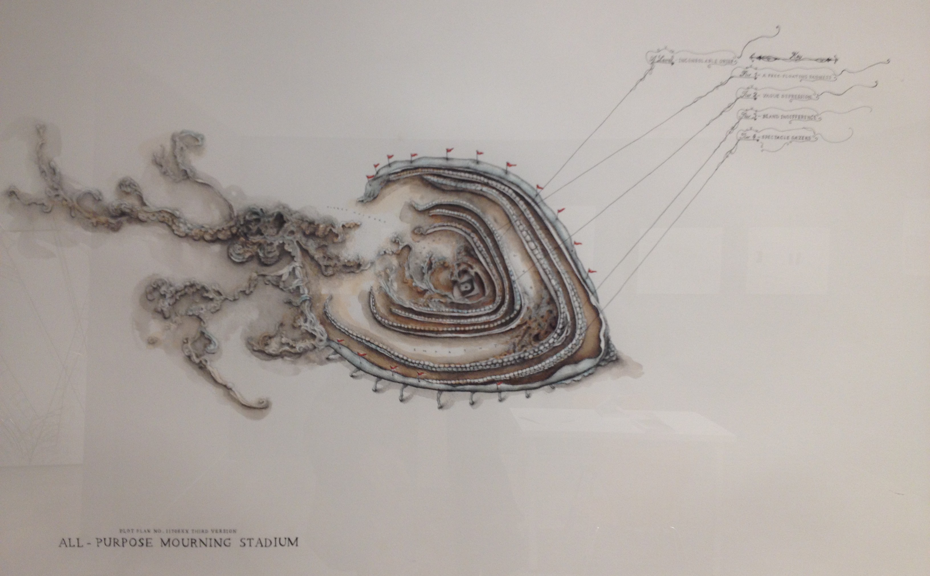
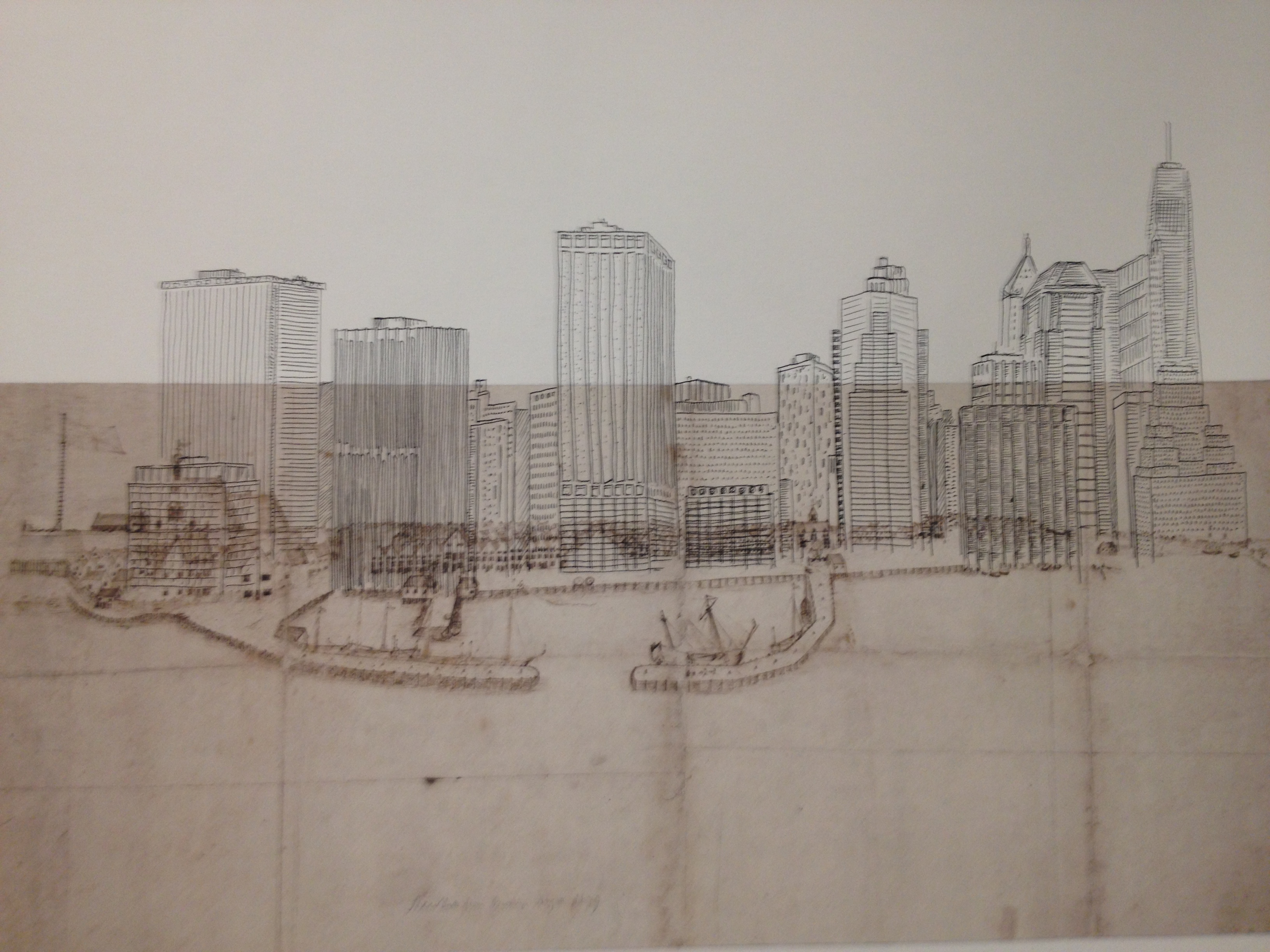
If you like maps as much as I do, you will be interested in the exhibition entitled Mapping Brooklyn at BRIC. This is no old maps from early sixteenth century explorers but artists who tackle the subject in a contemporary and innovative way. To give you a foretaste, here are my favorite pieces of the exhibit:
[ ](https://lesarchitectures.files.wordpress.com/2015/03/img_5915.jpg)
[ ](https://lesarchitectures.files.wordpress.com/2015/03/img_5929.jpg)
[ ](https://lesarchitectures.files.wordpress.com/2015/03/img_5926.jpg)
[ ](https://lesarchitectures.files.wordpress.com/2015/03/img_5924.jpg)
I had the chance to attend the related program Stoop Series: Digital City, Google Maps hackers, where three artists presented their work, dealing with territory in very different ways.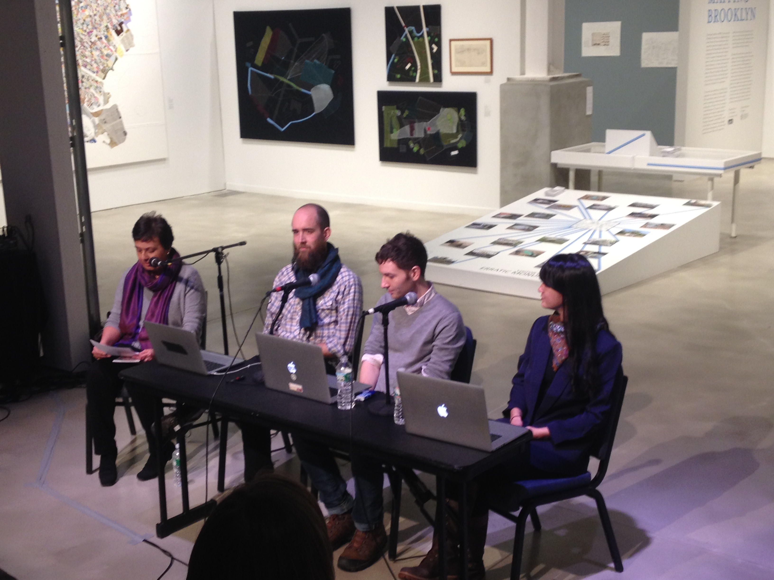
Justin Blinder, with his project Vacated, deals with the relation between data and context, as numbers linked to physical artefacts. He wants to re-context geographical data by street level views. Places and neighborhoods change over time and this is what is to be shown. Like Urban Layers, the artist uses public data from PLUTO, namely about properties, to locate recent urban and architectural modifications. He then crosses this information with Google maps street views.
Analyses and graphic representations of change, like this one from the NYTimes, are very interesting; but how does it look in real? What does that mean for local landscape? Is there a way to document urban change both en masse and from a street level perspective? As Google street views were not all taken the same day, the artist was able to use inconsistencies in the program at the location of change. The main result of this analysis is a video record of back and forth mouse movement in the application. For new buildings, this means having a before-after video which is pretty cool:
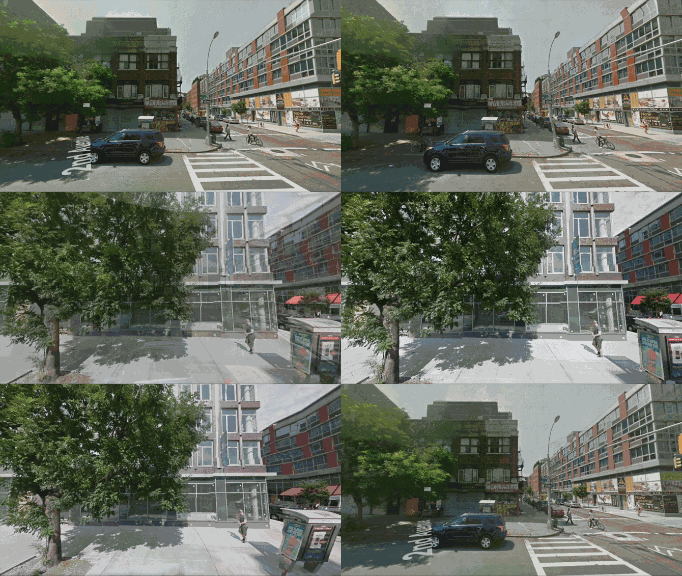
The artist sees it as archives of a ever changing city. It is about the buildings but above all about infrastructure around new construction, which is what gives the character to any area. Time and its effects on life are the core question of the project. This is not a conclusion or a manifesto about gentrification but a tool to better understand data.
Brian House is a musician. When he approaches data and maps, it is through the body. What he likes about this embodiment is the difference and individuality it reveals about human beings. The first project he presents is a sound recording following his steps rhythm during a specific walk. He then re-do the same walk while listening to the recording, feeling the difference, unbalance and irregularity with his first walk. To introduce the second project, the artist compares our phone as a prosthesis. The phone of one of his friend was stolen and thanks to the iPhone location tool, they were able to retrace the trip of its thief, from which the artist did a video.
Another of his project is a secure data locker for personal location information constructed from personal data collected during a certain period of time. As personal experience is more time based, the map visualization gives another point of view of the past year. Playing with data, the artist is then looking for patterns through different graphics. Finally, his last project is a record for time. Data is once again the basis of the project. Associating musical principles to different criteria (such as city as key and place as interval), a vinyl is eventually recorded.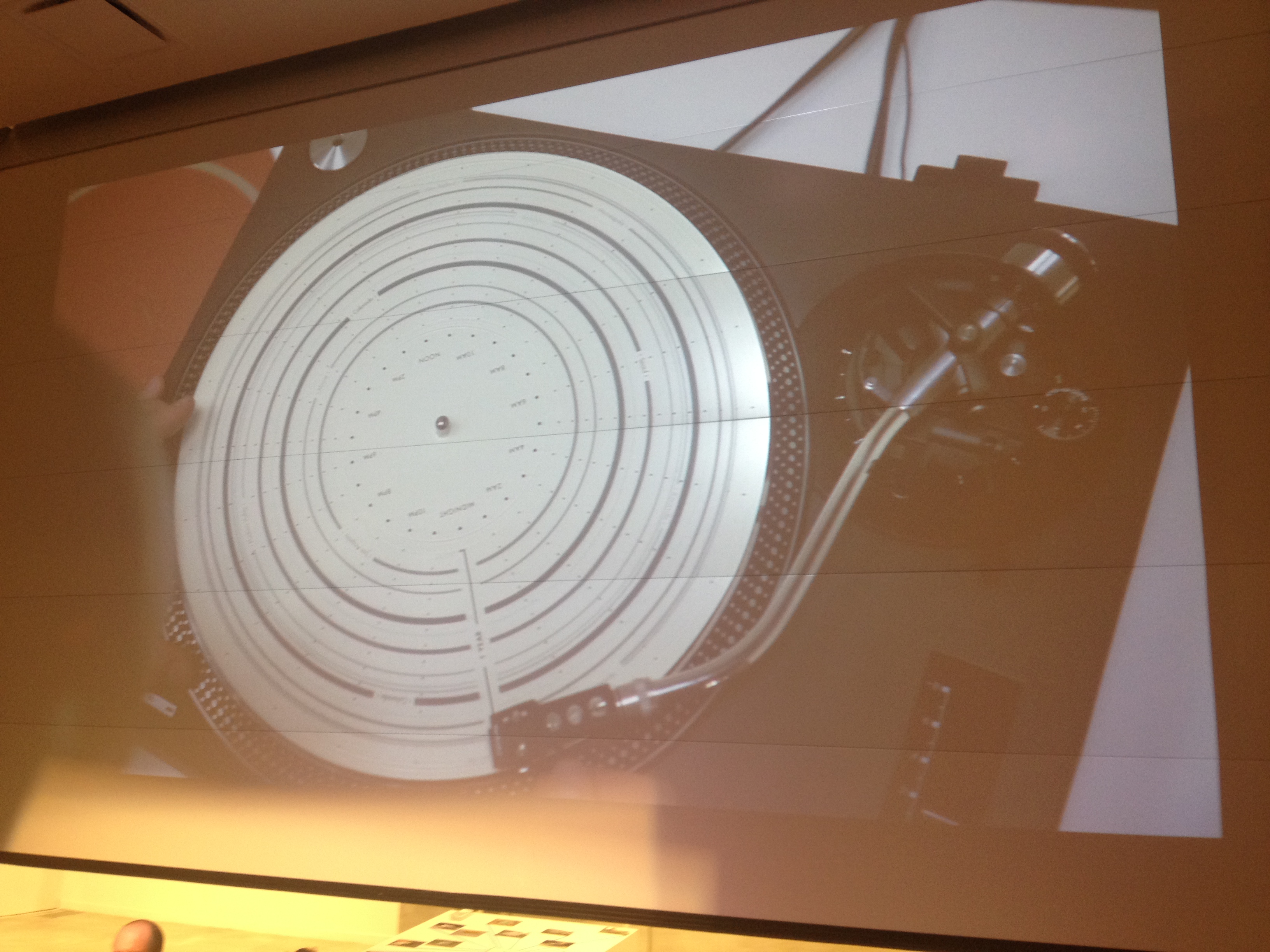
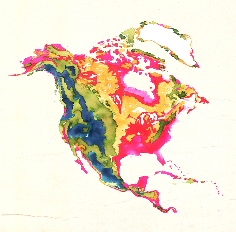
Jennifer Maravillas is passionate about maps. After visiting San Francisco and drawing or taking pictures from every angle, she felt like she needed to take a higher perspective. She then worked on Google maps transformed through Photoshop Coloring.
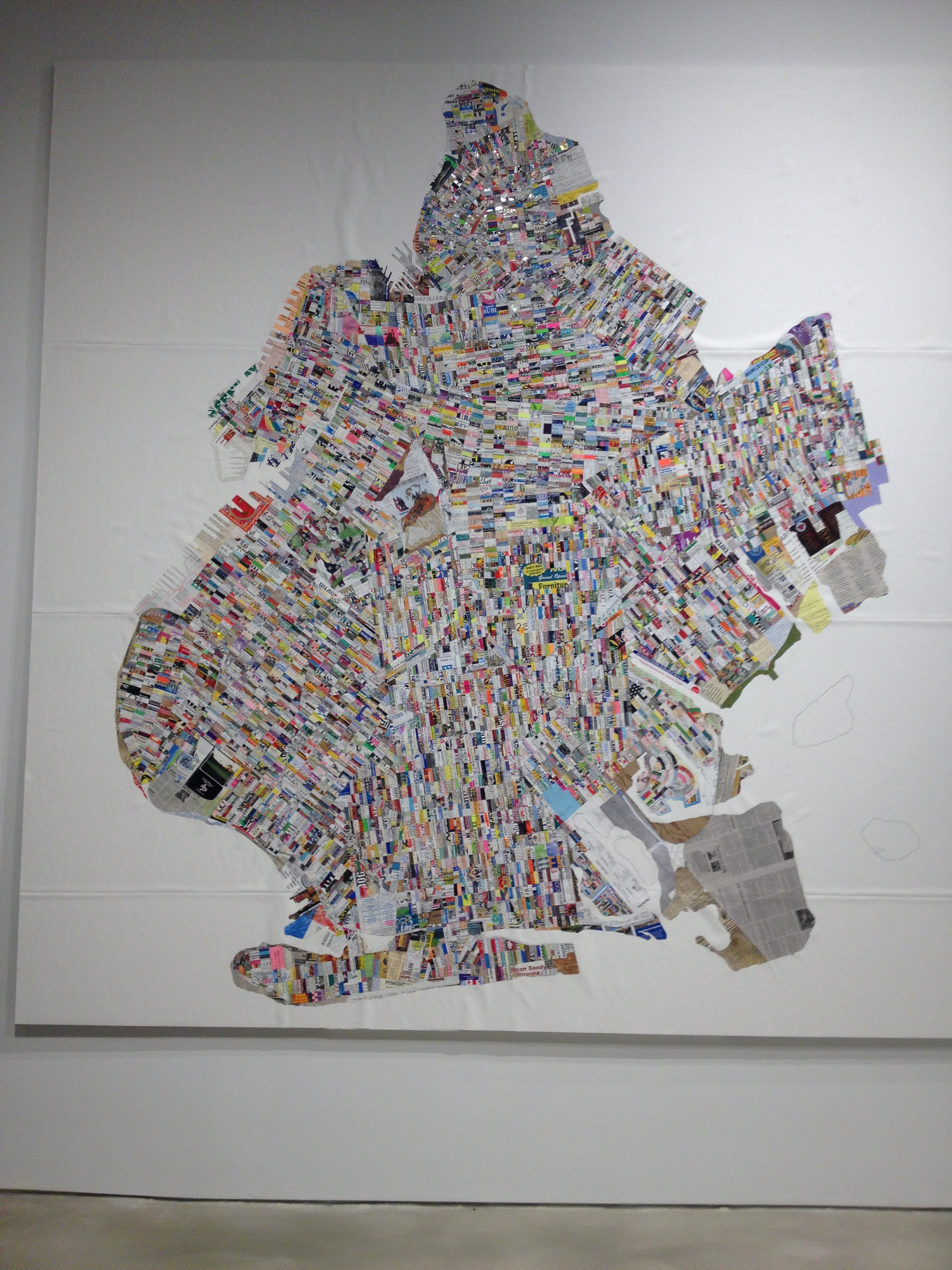
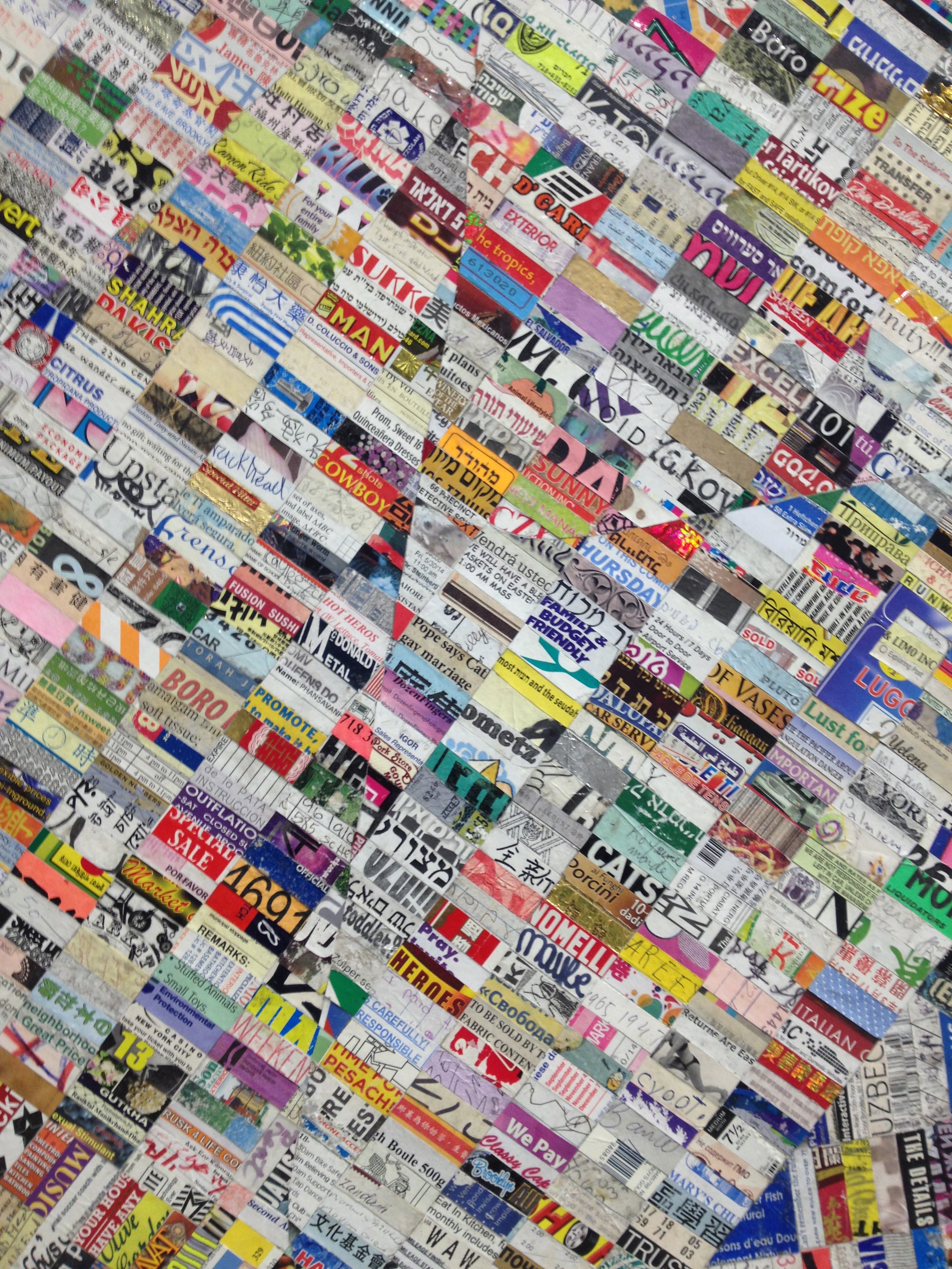
 The next project she did, presented in the exhibit, marks a re-connection with the field. She built a huge map of Brooklyn using trash papers personally collected on each block, pieces with their own story puzzled together to offer a larger view of the city.
Mapping Brooklyn runs through May the 3d, highly recommended !
